

Communication tools shape how remote design teams work.
Remote design teams live in tools like Slack to collaborate, share feedback, and stay aligned. But those same tools create friction for designers who need deep focus — interruptions, context switching, and scattered feedback pull them out of creative flow.
Over a 10-week research project, our team explored how communication tools could better support designers' day-to-day work.
Small friction adds up to broken creative flow.
Early research showed remote designers lose real time to small communication tasks that fragment the day:
Channel scanning
Searching crowded Slack channels for the right thread.
Feedback hunting
Tracking down feedback scattered across conversations.
Tool switching
Hopping between Slack and design tools like Figma.
Routine repetition
Repeating the same small tasks all day.
“These interruptions seem minor individually — but collectively they break the creative flow that designers depend on.”
Designers stayed in flow longer.
In user testing, both concepts helped designers stay focused, move faster, and feel more organized:
Sustained focus
Stayed on design tasks longer between interruptions.
Faster access to conversations
Less scrolling, less searching.
Application switching
Fewer hops between Slack and Figma.
Sense of organization
Felt more in control juggling multiple projects.
Two methods, two patterns.
To better understand the problem space, we ran a competitive analysis and a round of user interviews with remote designers in both corporate and startup environments.
Tools nailed half the equation.
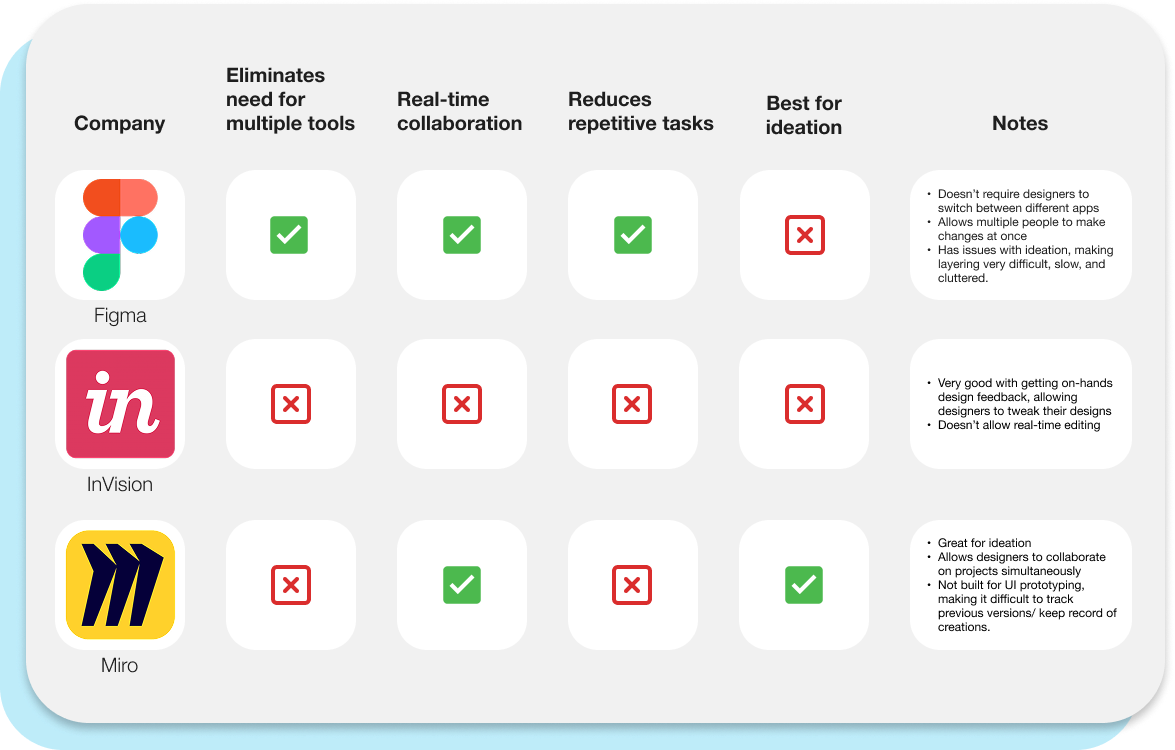
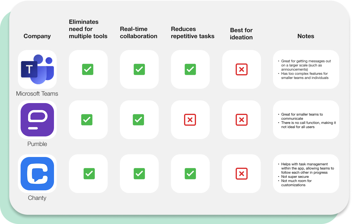
We analyzed collaboration and communication tools — Figma, Miro, InVision, Slack, and Microsoft Teams — across how each supported design collaboration, real-time conversation, and uninterrupted focus.
Many tools excelled at either design collaboration or team communication, but none fully addressed the friction between the two experiences.
Two themes from designer interviews.
Across every interview, two patterns kept resurfacing:
Feedback was hard to locate
Designers dug through channels and threads to find project-specific feedback.
Context switching broke flow
Hopping between Slack and Figma to read comments and share updates felt repetitive during focused work.
“I know the feedback exists somewhere — I just don't remember where.”
Two principles guided the redesign.
Keep designers in their flow
Reduce the need to leave the design environment for routine communication tasks.
Surface relevant information faster
Help designers reach project conversations without navigating dozens of channels.
Two features that quiet the noise.
We proposed two features aimed at reducing communication friction for remote designers — one that brings Slack onto the canvas, and one that surfaces the most-used channels at a glance.
Slack as a quiet layer on top of the canvas.
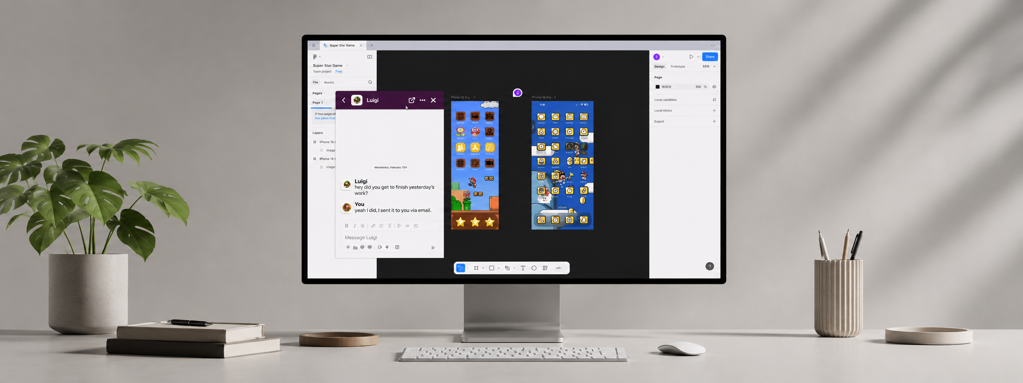
A lightweight Slack messaging window that stays visible while designers work in tools like Figma. Designers can view incoming messages, respond to teammates, and reference feedback without ever leaving their canvas.
This approach minimizes workflow interruptions and lowers the cognitive cost of context switching.
Most-used channels, one click away.
A dedicated area for prioritizing frequently used project channels — so designers can jump into active projects without scrolling through long channel lists.
Research showed that finding the right conversation was often just as frustrating as responding to it. Prioritizing important channels reduces navigation time and helps designers stay organized.
Each decision answered a specific user need.
Access feedback quickly
→ Pop-up messaging panel
Avoid switching applications
→ Persistent communication overlay
Find conversations faster
→ Pinned project channels
Reduce repetitive navigation
→ Prioritized workspace organization
From wireframes to interactive prototype.
We translated these ideas into user flows, low-fidelity wireframes, and interactive prototypes — iterating through user testing rounds with the same designers we'd interviewed.
A concept, not a shipped product.
This was a conceptual redesign — not implemented by Slack — but it demonstrated how small workflow improvements can have a meaningful impact on collaborative design work.
Design the workflow, not just the interface.
I started this project focused on improving screens and features. Through research, I learned that the real problem lived in the workflow between tools, not within any single interface.
The most valuable insights came from speaking directly with designers. User interviews surfaced pain points that competitive analysis alone never would have, and ultimately shaped our final direction.
What I'd explore next.
If I continued the project, I'd push toward deeper integrations between communication and design platforms — like surfacing Figma comments directly within Slack conversations, or automatically organizing feedback by project context.