Kate Hong Designs
One source of truth for the brand and the site — foundations, voice, and the pieces they build into. Everything here is generated from the same tokens the site runs on (app/globals.css and lib/motion.ts), so the reference and the product never drift.
One studio, four moods.
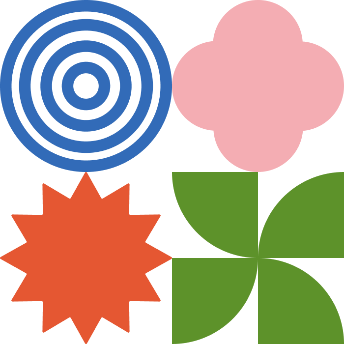

Rings
#326bb8
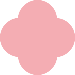
Quatrefoil
#f4adb3

Pinwheel
#5d922a

Starburst
#e55732
Neue Haas Display
--color-mode-rings
Redaction (italic)
--color-mode-clover
Barbra
--color-mode-burst
JetBrains Mono
--color-mode-fan
Warm, clear, and human-first.
“I’m Kate, a designer who loves intuitive experiences, strategic storytelling, creating clarity, and people.”
Human-first
Lead with the person, not the feature. “problems that feel impossible until you talk to the person living them.”
Clear over clever
Plain words, short sentences, no jargon. Clarity is the whole point of the work.
Strategic
Ground claims in research and outcomes — insights, friction, trade-offs, not adjectives.
Lightly playful
A little whimsy is on-brand — “doodles, daydreams” — but it never undercuts the substance.
Ink on ghost-white, with four accents.
Canvas
--color-canvas
Canvas warm
--color-canvas-warm
Ink
--color-ink
Ink soft
--color-ink-soft
Blue — Rings
--color-blue
Green — Pinwheel
--color-green
Orange — Starburst
--color-orange
Pink — Quatrefoil
--color-pink
A serif that leads, a sans that carries.
Source Serif 4
.font-display / --font-display
Creating clarity.
Neue Haas Display
.font-sans / --font-sans
Research-led, content-first.
Redaction
.font-wm-redaction
kate hong designs
Barbra
.font-wm-barbra
JetBrains Mono
.font-wm-mono
kate hong designs
One container, one gutter.
--layout-max
1320px
Shared content max-width (mx-auto).
--gutter
1.5rem (24px)
Page side padding, mobile.
--gutter-lg
2.5rem (40px)
Page side padding, sm and up.
Softly squared, gently lifted.
--radius-card
4px · rounded-card
Cards, images, frames.
--radius-control
6px · rounded-control
Toggles & control groups.
--shadow-card
0 14px 38px -12px rgba(0,0,0,.32)
Resting card elevation.
--shadow-modal
0 28px 60px -22px rgba(0,0,0,.45)
Modals & overlays.
A quiet dot grid underneath it all.
.bg-dotgrid
--dot-ink · --dot-size (22px) — page background
.bg-dotgrid-card
--dot-ink-strong · --dot-size-card (16px) — frames
One curve, a handful of speeds.
EASE_OUT) and a small duration scale (DUR). Entrances reveal on scroll; interactions use spring physics. It all respects prefers-reduced-motion.transition={ duration: 0.7, ease: EASE_OUT }
Every entrance, hover, and reveal shares this one curve. Under prefers-reduced-motion the site degrades to instant.
The pieces, assembled.
Real work, framed simply.
- · Fill the frame with
object-cover; corners arerounded-card. - · No accent borders on real images — let the work speak.
- · Loop card videos muted; provide a poster frame.
- · Placeholders use
.bg-dotgrid-card+ the ◍ label.